What a Design System Has to Carry
An agent follows every rule you write and invents the rest. What a design system has to contain for twenty generated screens to agree with each other — and to look like something while they do.
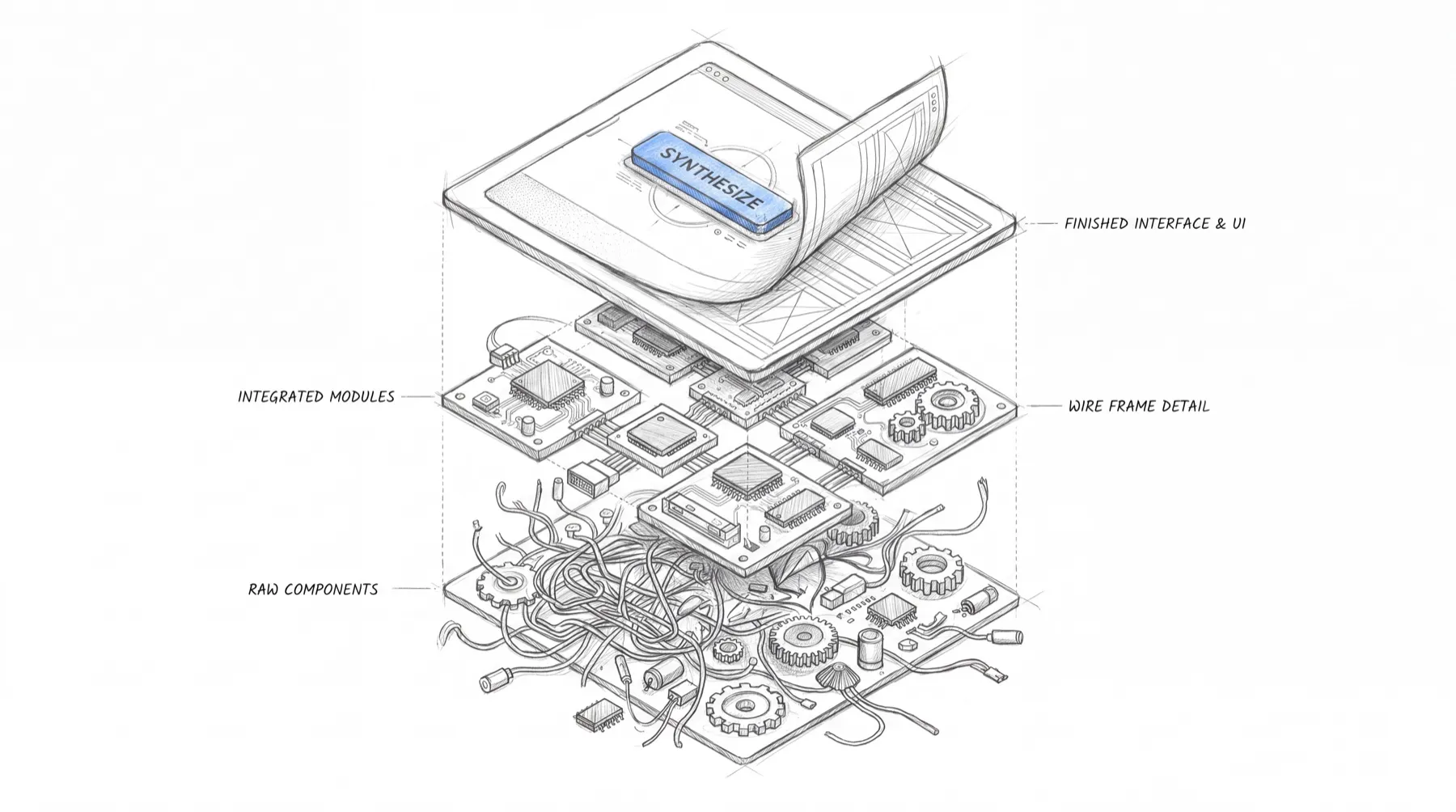
AI can generate a pretty good interface from a handful of instructions. The challenge is getting it to build twenty screens that feel like they belong to the same product. That takes more than a component library.
Ask an AI agent to build a settings screen and you’ll probably get something reasonable. Ask it to build an entire application over the course of a month, and things get interesting. Row heights start to drift. Empty states use different language. A drawer on one screen becomes a modal on another. Components that should behave the same way develop their own little personalities.
None of these decisions is necessarily wrong on its own. The problem becomes apparent when you put everything together. You end up with an application that looks like several different products happened to share a logo.
I’ve been thinking about what a design system needs to do differently when AI is doing more of the actual interface work.
The underlying problem isn’t new. Designers and developers have always needed shared rules, reusable components, and a common understanding of how a product should work. What’s changed is how much of that understanding has to be made explicit. A person can look at an existing interface, pick up on its conventions, and carry those conventions into the next screen. An AI agent works from the context and instructions available to it. Where the system leaves gaps, the agent fills them in. That’s useful when you want it to explore possibilities. It’s less useful when you’re trying to maintain a coherent product.
The design system has to do two things: keep the interface consistent and give the product its own identity. Those are related problems, but they aren’t the same one.
Five things the system needs to get right
I find it useful to think about a design system in five categories:
- Values: The foundations that define how the interface is constructed.
- Coverage: The parts of the interface the system accounts for.
- Decisions: The rules that determine which patterns to use and when.
- Completeness: Everything a screen needs beyond the ideal scenario.
- Proof: Ways to verify that the system is actually being followed.
Most design systems have the first category covered reasonably well. The other four are where things tend to get more interesting.
1. Values: More than a collection of tokens
Color, typography, spacing, sizing, and other design tokens are still the foundation. A sensible token hierarchy gives you a set of primitives, semantic roles built on those primitives, and component-specific values when there’s a good reason for them. The important part is understanding what each layer represents. A primitive is a raw design value. A semantic token gives that value a job. A component-specific exception accommodates something that genuinely needs to work differently.
Those distinctions make a difference when the system evolves. Changing a primitive might be part of a brand decision. Changing a semantic token might affect how an entire class of interface elements behaves. Finding a hardcoded color buried in an application component might mean somebody bypassed the system altogether. When those relationships are clear, reviewing a change becomes much easier. You can see what kind of decision is being made instead of treating every change as an isolated adjustment.
There’s another reason to document these choices: not every good design decision comes from following a mathematical formula. A type scale might be adjusted by eye because a mathematically consistent ratio doesn’t quite work with the chosen typeface. A neutral palette might need more steps than expected to create enough separation between surfaces in a dark interface. These are deliberate decisions, not mistakes waiting to be corrected.
An AI agent doesn’t necessarily know why a designer made a particular adjustment. If the rationale isn’t captured anywhere, the agent might replace it with something more conventional that happens to look worse. The system needs to preserve the reasoning behind the values, not just the values themselves.
2. Coverage: Know what you’ve defined
This is one of the bigger differences between designing an interface by hand and generating one from a set of rules. When a designer encounters something the design system doesn’t cover, they can recognize the gap and decide what to do about it. An AI agent will often just keep going. If there’s no defined chart palette, it might choose one. If there’s no secondary feedback state, it might invent one. If the system doesn’t specify how a particular type of card should behave, the agent has to make that decision itself. Sometimes the result will be fine. Sometimes it will introduce a new convention that conflicts with the rest of the application.
The obvious solution is to expand the system, but trying to anticipate every possible interface element is a losing game. No design system can account for everything a product might eventually need. What matters is knowing what’s covered, what’s intentionally excluded, and what still needs a decision. Even an explicit declaration that something isn’t applicable can be useful. It tells the agent that the absence is intentional rather than an invitation to improvise.
This also means keeping things that look similar but serve different purposes separate. Take chart colors and status colors. A green line in a chart might identify a particular data series. A green indicator elsewhere might communicate that an operation succeeded. The colors look similar, but their meanings are different. If the system treats them as interchangeable, it becomes much easier to introduce visual inconsistencies that also create problems for interpretation.
The goal isn’t to define every possible value. It’s to make sure the system knows which decisions have already been made.
3. Decisions: Tell the agent how to choose
A design system can have a perfectly good collection of components and still leave too much room for interpretation. Consider the instruction “use modals sparingly.” A designer understands the general intent. They can look at a particular interaction, weigh the trade-offs, and decide whether a modal makes sense. An AI agent can follow the instruction, but it still needs to determine what sparingly means and what to use instead.
That’s where explicit decision rules help. For example:
| Situation | Default pattern |
|---|---|
| A focused decision with a small number of fields | Modal |
| Supplementary information that shouldn’t interrupt the current task | Drawer |
| Additional detail belonging to a specific row or card | Inline expansion |
| An object that needs its own address and can be shared directly | Dedicated route |
| A process with multiple steps and its own context | Dedicated workflow or takeover |
These aren’t universal rules. There will always be situations where another pattern makes more sense. That’s fine. The point is to establish a useful default and give the agent enough context to recognize when it should follow that default. When a departure is necessary, the reason should be recorded. Otherwise, exceptions accumulate without anyone understanding why they exist, and the system gradually becomes a collection of unrelated decisions.
This is also where a design system starts to become more than a library of reusable UI. It begins to describe how the product works. That distinction matters because two interfaces can use exactly the same components and still behave very differently. The components provide the building blocks. The decisions determine how those blocks are assembled into a coherent experience.
4. Completeness: Design for the screen someone actually uses
AI is good at generating the happy path. Give it a list of requirements and a visual reference, and it can produce a convincing screen showing the data, controls, and interactions you’d expect to see. The less obvious states are another matter.
What happens when a user opens a screen for the first time and there’s no data? What if a search returns nothing? What if the user doesn’t have permission to access a feature? What happens when the network disappears halfway through an operation? These aren’t unusual edge cases. They’re ordinary parts of using software.
A useful system needs to account for things like:
- First-run and empty states
- Searches and filters that return no results
- Loading and partial-data states
- Network failures and stale information
- Permission errors
- Disabled and selected controls
- Validation and submission errors
- Content that exceeds expected limits
- Keyboard focus and other accessibility states
The list will vary by product, but the principle stays the same: these states need to be part of the definition of a finished interface. Otherwise, it’s easy to mistake a successful demonstration for a finished product. The screen looks right when everything works exactly as expected. The problems start when someone uses it under ordinary conditions.
This is one reason I think design systems need to document behavior alongside appearance. A component isn’t fully defined by its default state. Its behavior under different conditions is part of the component, too. The more clearly those states are specified, the less an agent has to invent when the happy path ends.
5. Proof: Make the rules testable
A design system is only useful if you can tell whether an implementation follows it. Some requirements are relatively easy to test. You can check whether components use approved tokens, whether text and backgrounds meet contrast requirements, and whether defined motion limits are respected. Other requirements need a more deliberate approach.
For example, testing every color pairing that happens to exist in the application doesn’t tell you whether all the required pairings have been implemented. A missing category might never make it into the test results at all. It’s better to define the combinations the system requires and verify that they’re present and valid.
The same principle applies to interaction and motion. Instructions such as “keep the animation subtle” communicate an intention, but they don’t establish a measurable limit. If duration, easing, or other motion characteristics matter, define the acceptable range where practical.
Not everything about design can be reduced to a test. That’s not the goal. The goal is to make the objective requirements verifiable, so that designers and developers can spend their time evaluating the things that genuinely require judgment.
It also gives an AI agent a more useful target. Instead of asking it to follow a collection of guidelines and hoping for the best, you can check whether the implementation meets the requirements. That won’t guarantee a good interface. It will make certain kinds of mistakes easier to catch before they spread.
Consistency isn’t the same as character
Here’s the part that interests me most. You can build a design system that does an excellent job of preventing inconsistencies and still end up with a product that looks completely generic. Every screen uses the correct spacing. The typography is consistent. The components behave as expected. The contrast passes. Nothing is technically wrong. And the product still looks like everything else.
That’s because consistency and identity solve different problems. A design system should establish a dependable baseline. The product’s character comes from the decisions layered on top of it: typography, color, imagery, interaction, composition, and the details that make one product feel different from another.
The baseline can have some personality of its own, too. I’ve deliberately moved away from familiar default choices in favor of values that felt more considered for the interface I was building. Even something as small as choosing an accent color that doesn’t look like it came straight out of a default utility palette can help establish a more distinctive starting point. Those choices matter, but they’re harder to specify than a spacing value or a contrast ratio.
Most of the rules we’ve discussed can prevent something from going wrong. Coverage limits invention. Completeness helps prevent unfinished interfaces. Testing catches measurable defects. None of those things tells you whether the result is interesting, whether the hierarchy feels right, or whether the product has a visual identity worth remembering. That still requires design judgment.
And I don’t think the answer is to try to turn every aesthetic decision into another rigid rule. Over-specification can make a system brittle, leaving the agent unable to handle a genuinely new situation without breaking something. The trick is deciding which parts of the experience need strict consistency and which parts need room for interpretation. That’s a design decision in its own right.
What we’re asking the system to do
As AI takes on more interface generation, the design system becomes an increasingly important part of the product’s architecture. It has to communicate not only how things look, but also how they behave, which decisions are settled, which situations have been accounted for, and where the boundaries of the system lie. That requires more thought than assembling a component library and documenting a set of tokens. It means making the reasoning behind the interface available to the people and tools building it.
There’s a practical benefit to doing this work. A well-defined system gives an AI agent less room to make arbitrary decisions, makes the results easier to evaluate, and gives the team a clearer basis for improving the product over time.
But there’s a limit to what rules can accomplish. We can get increasingly good at specifying what an interface should do, how it should respond, and which visual mistakes it shouldn’t make. We’re still responsible for deciding what makes the experience worth using in the first place.
A design system can help an AI build the product consistently. Making that product feel like it belongs to someone, serves a real purpose, and has a point of view is still the work of design.