Enlyt Health
One patient app that launches under a dozen-plus health system brands, in production since 2018 and installed by millions of patients. Each client starts from the same out-of-the-box design — some ship it themed to their palette, others rebuild whole flows — and the component library underneath is what turned a one-to-two-year build into a ninety-day launch.
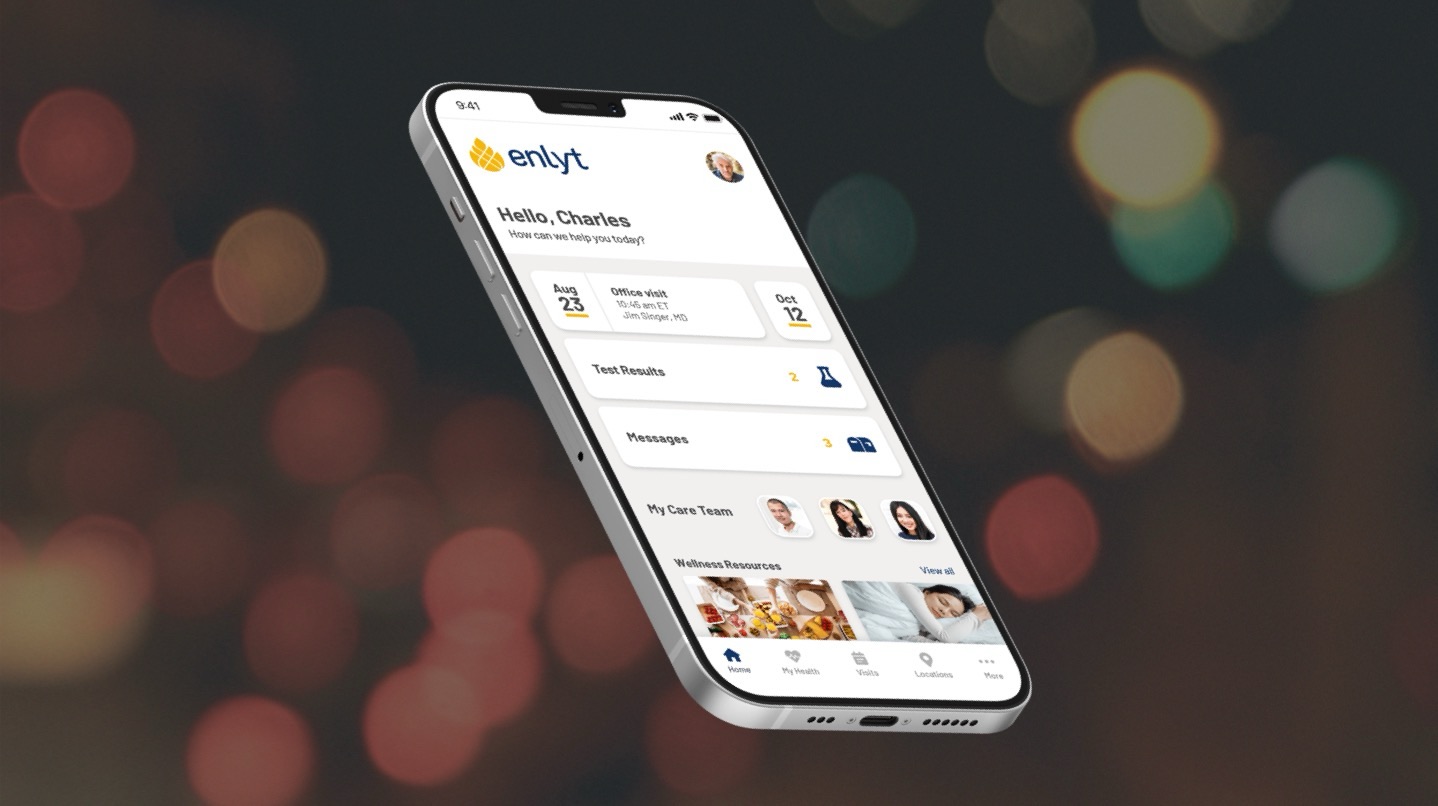
A component library health systems make their own
Enlyt ships as a library of patient-facing components that a health system adopts, themes and assembles into its own front door. Scheduling, records, messaging, billing and wellness all ship as configurable blocks, which is why a launch takes about 90–120 days instead of one to two years. Below is that library running live: 33 screens of real markup, themed as Enlyt's own reference brand.
- Provider directory and appointment booking, with a working calendar
- Visit management — upcoming, past, reschedule and cancel
- Health records: lab results with reference ranges, medications, allergies, immunizations
- Secure messaging between patient and care team
- Bill pay, insurance cards, plans and claims
- Location finder with map, list and wayfinding
- Enlyt Shine wellness journeys, themed per service line
- Onboarding — registration, sign-in and EHR account linking
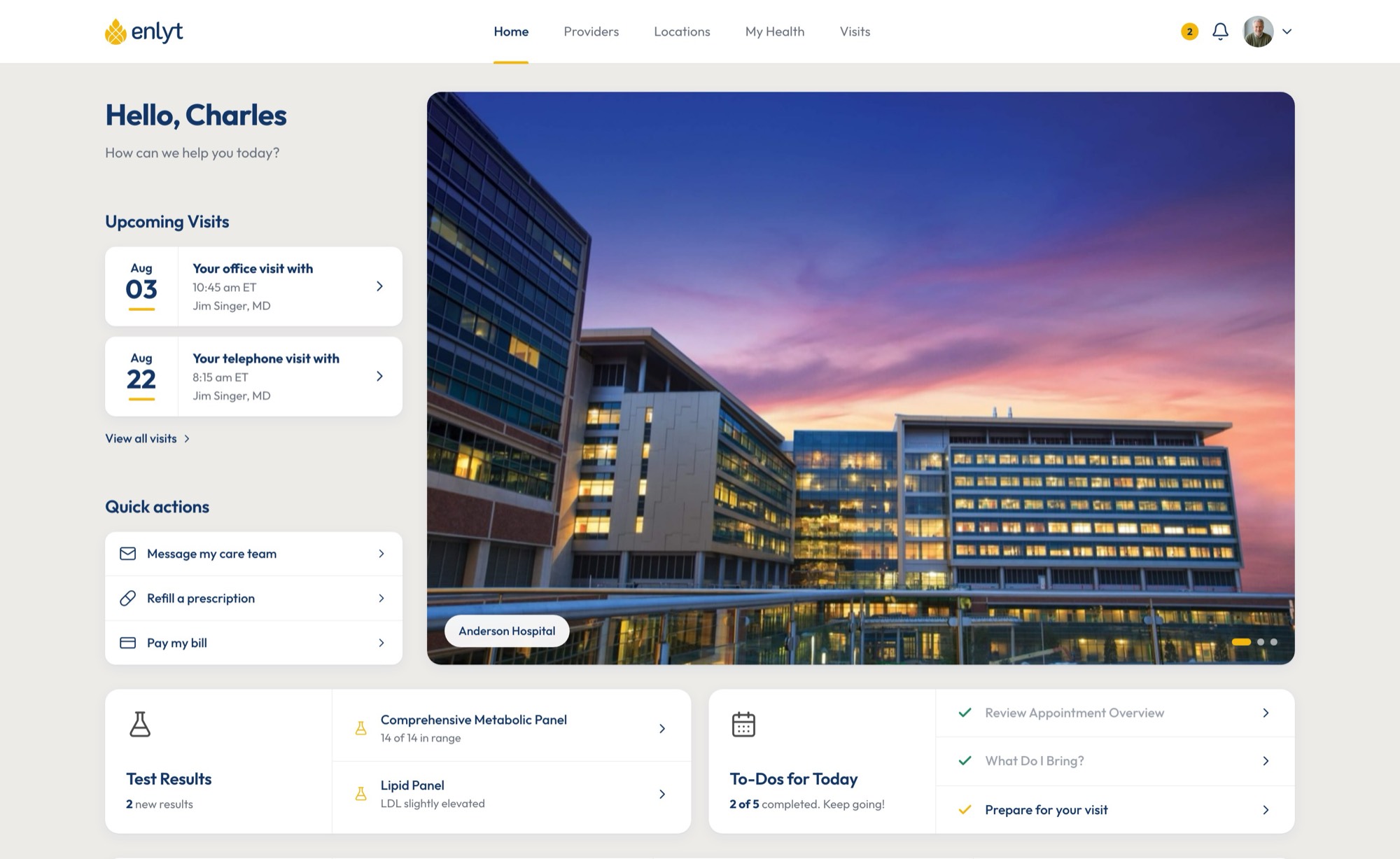
The same library, assembled for the desktop
Nothing here is a second build. The desktop portal is the same component set the phone draws from — same patient, same providers, same record — re-assembled for a wider viewport and a pointer instead of a thumb. That is the whole premise of the library: a health system configures once and gets both front doors.
-
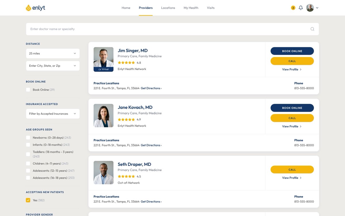
Provider directory Filter rail, ratings, booking -
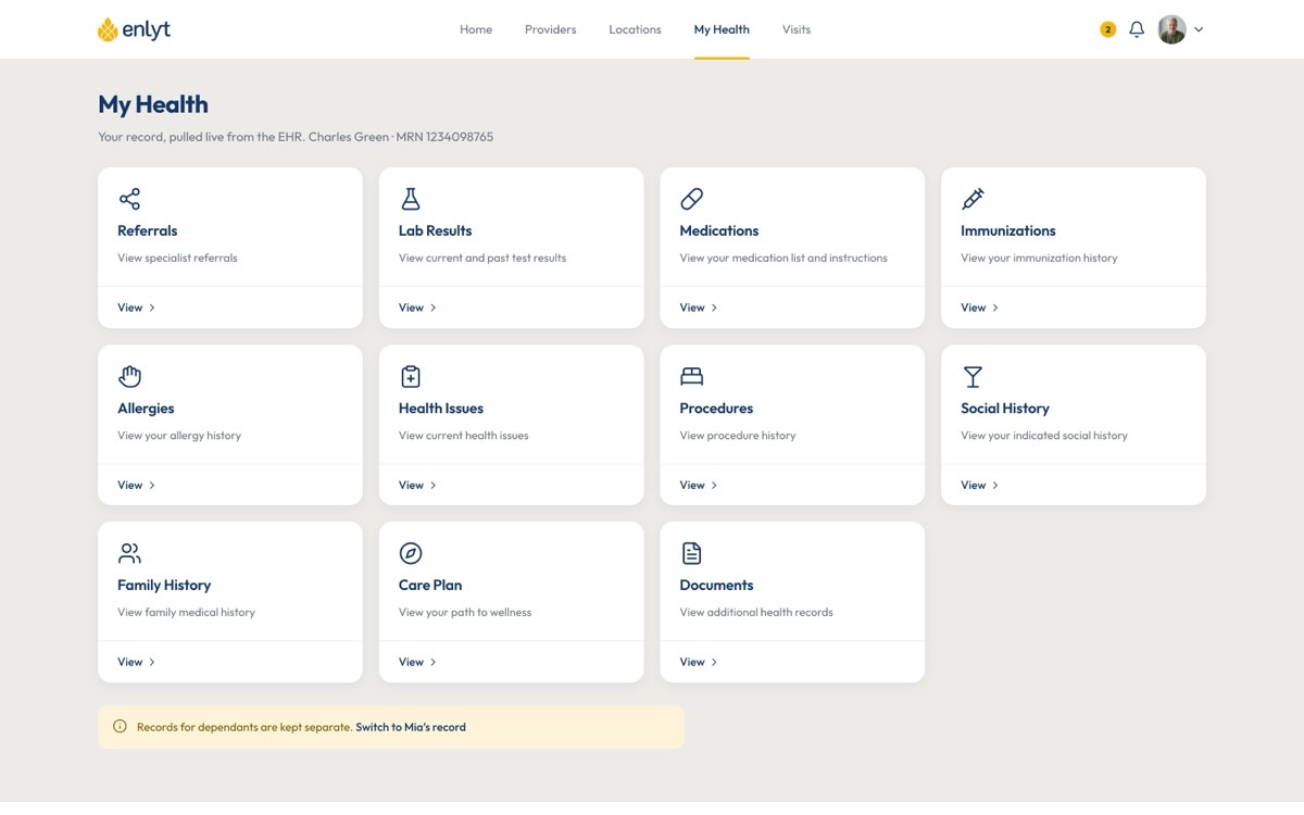
Health record 11 record types, EHR-backed -
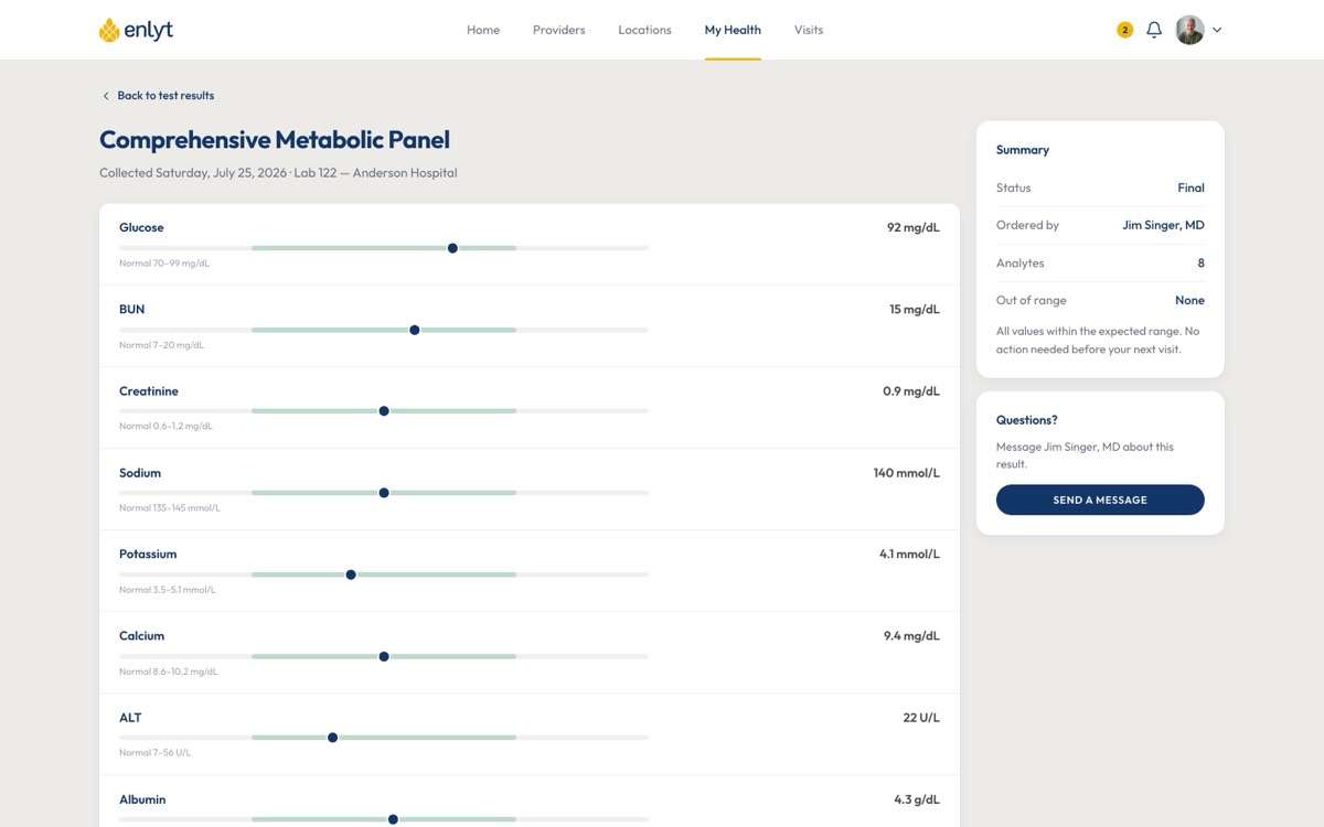
Lab results Values against reference ranges -
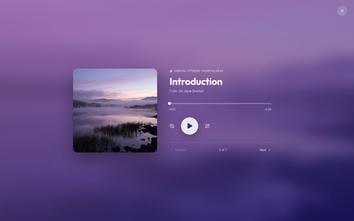
Enlyt Shine Full-window session player
- 54
- screens
- 9
- end-to-end flows
- 0
- screenshots — real markup
One product that ships as many
Every health system licenses the same platform and launches it as their own app — their brand, their color, their content. How far they take it is up to them: some ship the out-of-the-box design themed to their palette, some rework most of it, a few go fully custom. The question I kept coming back to was how one design system stays coherent wearing CHOC's identity on Monday and Mercy Health's on Tuesday. The hard constraints were the SMART on FHIR APIs connecting each app to its EHR. No two vendors build those alike, some sit behind license agreements and added cost, and one shuts independent vendors out of its integration SDKs entirely — tooling the health system then has to cover itself.
What belongs in the box
Some clients launched a fully custom, branded experience. Some used 90% of the design system, themed to their palette. Some took 95% and expanded a single screen — lab results, grown to give patients more education. So the real question was what the default should cover, since anything it missed became work every client repeated. Beta feedback is how I answered it. I worked directly with clinical teams, chief product officers and IT directors at each health system. Feedback came in as Jira tickets organized by epic, including what their beta patients reported — I didn't work with patients directly. Requests that showed up across systems went into the default. One-offs stayed client customizations.
- 01
Theming as a starting point
Out of the box, color, type and logo restyle the entire app, and most systems launched that way. Clients who wanted more could rework whatever they needed — the default just had to look finished after a palette swap.
- 02
A component library
Physician search, scheduling, records and bill pay shipped as configurable blocks. Teams assemble a front door rather than commission one — which is where the timeline actually comes from.
- 03
Six products, five tabs
Records, scheduling, telehealth, messaging, wayfinding and wellness had been separate vendors. Collapsing them meant ranking what a patient does weekly against what they do once a year, and putting the rest behind More.
- 04
Designing around data you do not own
The EHR decides what comes back. Every record screen needed no-data, not-connected and partial states drawn up front, because for a real patient at least one of them is always on screen.
- 05
Wellness needed its own visual system
Enlyt Shine lives inside a clinical app but has to read as editorial. A per-service-line theme — gradient, motif and glyph — let it feel like a different product without leaving the shell.
- 06
Empty states carry the brand too
A patient with no upcoming visits sees the app more often than one with a full chart. Those screens got the same attention as the dense ones, because they are the ones most patients meet first.
The system is the deliverable
The platform has been in the field since 2018. It now ships under a dozen-plus health system brands, most standing up in about 90–120 days rather than one to two years, and installs across them have reached millions of patients. As Chief Creative Officer I owned the design system and the surfaces around it — the patient app, the admin tooling, the marketing site, and the sales material — which is what kept the story consistent from a pitch deck through to the app a patient actually opens.